Content is the backbone of an engaging inbound marketing campaign. It’s incredibly important for both retaining customers and attracting new readers and viewers to your business. While the content itself is key, knowing how to place and organize your content on a website is also incredibly important.
Think about it this way: typography is one of the most important ingredients in a complex presentation recipe. Get it wrong, and the flavour of your content is thrown off.
You could have the best content online, but if your customers can’t locate it, or have difficulty interpreting your message, it’s of no use to anyone. In this sense, typography isn’t given a lot of thought, but there’s little doubt among designers, marketers and content strategists that it strengthens your brand, creates interest in the products you’re selling and showcases the message you’re trying to shout out there.
Table of Contents
ToggleWhat Is Typography?
In practice, typography is the way that text is arranged on a page or document. It’s often called an art unto itself, as it uses creativity and innovation to direct the eye to a certain section of the page or motivate the reader to keep reading past the first paragraph.
It adds personality, creative flair, and character by creating interest and dictating the aesthetic appeal of your webpage. For example, if you were trying to promote and brand a party supply company for kids, a slick black and white text outline wouldn’t be the most appropriate way to entice readers into perceiving your brand as fun. In this example, a colourful and artistic text flow can prove to be a great way to advertise this type of a client.
Why Is Typography Important?
The aim of typography is to characterize and illustrate a deliberate feeling about the content, and therefore, the product or service the user is about to read about. If done correctly, it can generate a hugely favorable response from your targeted demographic.
A bold, tall and blocky font for example, can help to inspire confidence in the product – paired with a curvy and sensual cursive font can add an element of sophistication and grandeur, helping to lift the product into a new realm of perceived worth.
In websites and content tailored to children, it may seem obvious to mention that colours and hand-drawn fonts resonate well with their targeted market by boosting the visibility and level of involvement they create, but this is the effect of well thought-out typography. In this example, the fonts, placement and colours trigger emotion in the reader and hint at what kind of information is available.
Well-executed typography inspires people to continue reading. There’s a balance with typography that needs to be respected as well, as too many fonts, colours, shapes and creativity can prove overwhelming and too busy to keep a reader focused. If this balance is neglected, you run the risk of losing readers. It’s more important to ask yourself ‘how can I draw people in, while giving them easy access to the next step of consuming my content?’
The answer is in the use of engaging fonts and placement with your headlines, while making the main body of your text a familiar or traditional font.
Typography also tells people what’s important within your text – it helps to prioritize and organize new information. Bold text draws your attention, while italics emphasize the tone of the reader’s inner monologue, accentuating importance. Think about subtitles, additional headlines, and points of interest to help break a large piece into manageable, bite-sized bits of information.
Elements of Typography
The following are the most important elements to consider when selecting typography:
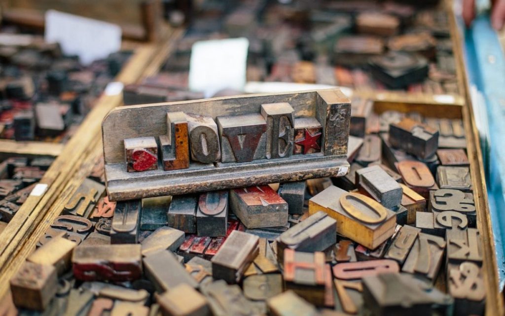
Fonts/ Typefaces
Fonts aren’t just the style of the letters, but also refer to the specific style of each typeface. For example; Helvetica is a typeface, while Helvetica, size 12, bold italic is a font.
Nowadays, the terminology typeface and font are used interchangeably, but it’s important to note that typeface refers to the style of the text. Arial, Times New Roman, and Chalkduster, for example, embody differences in their styling which is the realization of typeface – think of typeface, as a term that describes the visual aesthetic of the font.
Tracking / Kerning
Tracking is the space between each letter in a line or word of text. Tracking is typically very standardized by the programs you’re using, buy can be adjusted to affect text density. Similarly, kerning is much like tracking but refers to the physical white space in between each letter. In this sense, tracking is more of a measurement, while kerning is the visual cue that tracking has been adjusted.
Leading
Leading measures the physical space in between lines of text and can hugely affect how people interpret and read your content. If too far apart, it could be understood that each line is actually a subheading without the additional text bodies. Too tight together, and text becomes too difficult to read easily, running the risk of losing your reader altogether.
Together, these typographic elements contribute to the ways we view, interpret and organize language, content and how well your product or service will be portrayed to an interested reader.
The Impact of Typeface on Content
Tons of research has been conducted to understand how and which factors affect content the most.
In 2012, The New York Times conducted an experiment on their unsuspecting readers by presenting a two-part series designed to test how information is perceived when presented in different typefaces. To conduct the experiment, 40,000 readers were shown the same information, but in six different font styles. Author Errol Morris called it a “test of the effect of typefaces on truth.”
Readers who were shown the passages in Baskerville were much more likely to agree with its validity, especially when compared to Comic Sans and Helvetica, for example.
In the study, Baskerville displayed a 1.5% advantage in agreement. This doesn’t seem like much, but consider if that increase translated to an improved sales figure – the fact that the only difference is typeface means that typography and visual aesthetics has a lot to do with the ways we interpret information.
Other studies show that the most preferred typefaces were Verdana, Arial, and Comic Sans – and that Courier was most legible at font size 12, whereas Arial was most legible at font size 14. Others denote, humorously, how Comic Sans is the most “hated” font among designers based on aesthetics and their finding the font overused and unprofessional.
By making typography a focal point of your content presentation strategy, your marketing campaigns are poised to gain valuable insight as to which types of information and styles best personify what your customers identify with, or value visually.